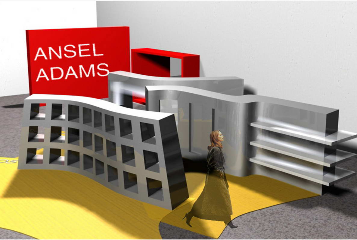
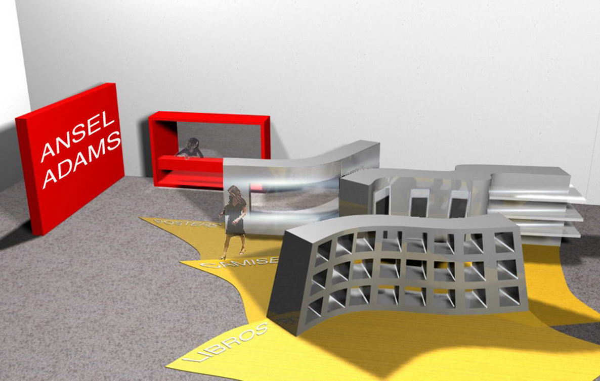
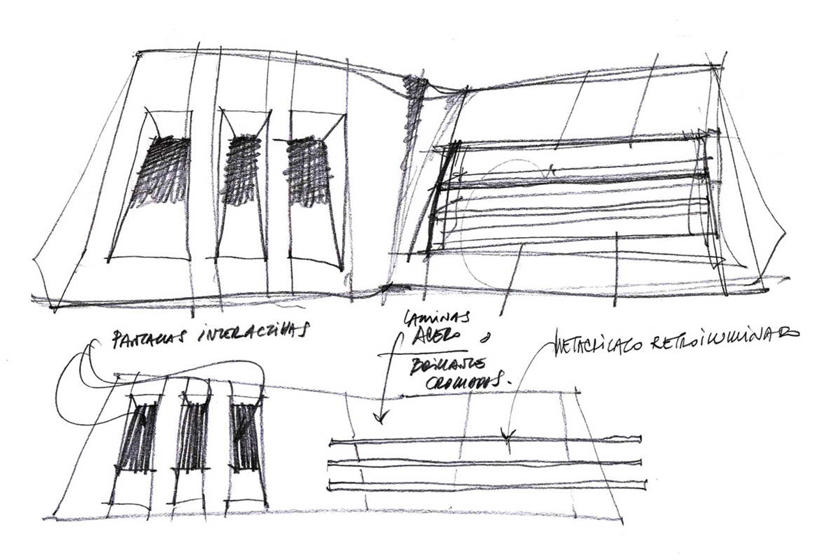
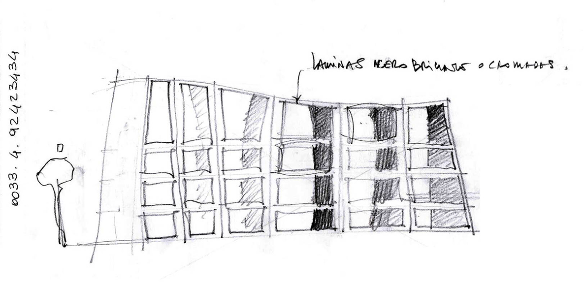
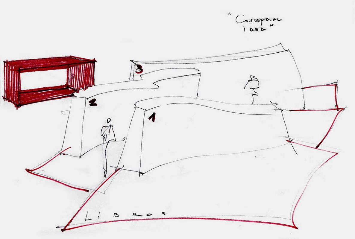
Designing space for the exhibition of works by the photographer ANSEL ADAMS came from an idea of three guidelines I drew on a sheet of paper which were then ‘transformed’ into three-dimensional reality.
The grey colour of the exhibit structure served as a backcloth-framework for the work of this ‘wizard of black and white photography’.

